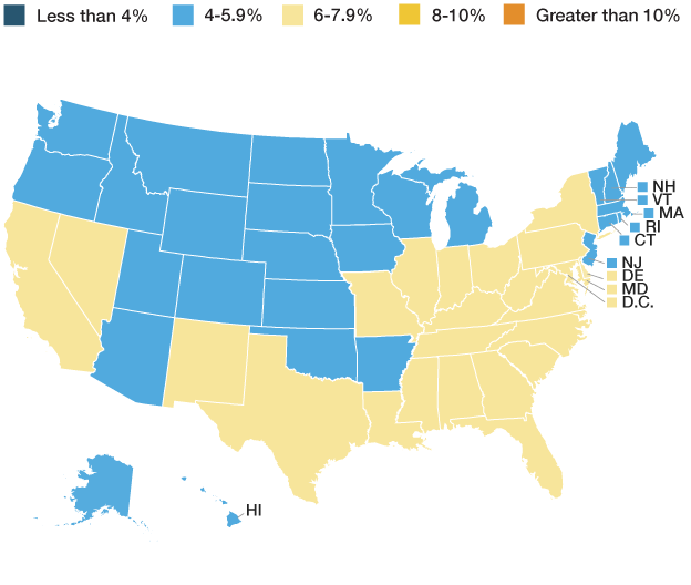
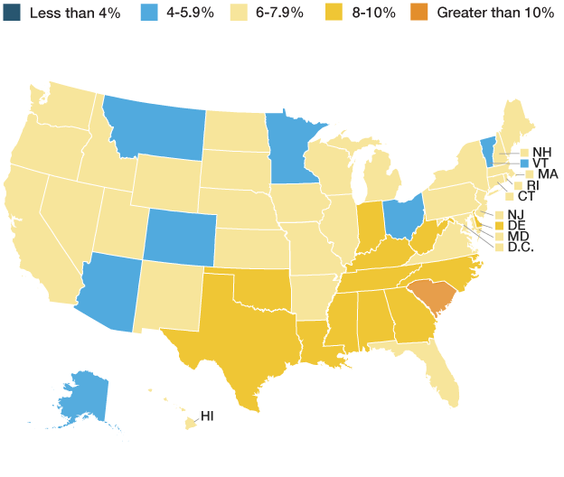
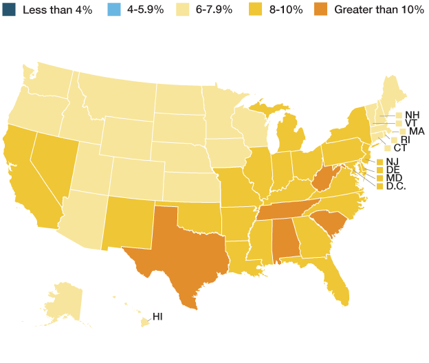
NPR had a great post dissecting the rise of diabetes in America in the last twenty years. Check out the graphic representation of the increase, it looks pretty frightening visually:
1995:

2000:

2005:

And, finally, 2010:
Basically: Yikes. And Happy Thanksgiving!

